

The single most universal Facebook ad image size is 1080×1080 px at a 1:1 aspect ratio, and for maximum mobile screen coverage in Feed, use 1080×1350 px at 4:5. Across placements, the 30 MB file size limit is the constraint that trips up more uploads than most creative teams expect.
The surprising part is that the best answer usually isn't one size. Most articles on the image size of Facebook ads stop at a list of dimensions, but that misses the decision that affects delivery and attention: which aspect ratio fits the placement your ad will really serve in. A square file is safe. A portrait file usually wins more visual space in mobile Feed. A full-screen vertical file is a different creative altogether.
That distinction matters because current guidance no longer points to one universal canvas. The practical baseline is still square, but recent guidance has clearly shifted toward portrait-friendly creative for Feed and 9:16 vertical for immersive placements. If you only remember one principle from this guide, use this one: design for the placement first, not for Facebook as a platform.
Table of Contents
- Facebook Ad Image Size Quick Reference
- Facebook Feed Ad Image Sizes
- Stories and Reels Vertical Ad Image Sizes
- Carousel and Collection Ad Image Sizes
- File Format, Resolution, and Size Limits
- Common Mistakes That Kill Ad Performance
- Design Optimization by Placement
- Related Resources and Next Steps
Facebook Ad Image Size Quick Reference
The wrong size rarely gets blamed first. Teams usually blame the offer, the audience, or the copy. In practice, I see creative lose momentum because it shows up smaller than it should, or because the message sits where the interface covers it.
If you need a clean default, start with 1080×1080. If mobile Feed is where you care most about attention, build 1080×1350. If the campaign includes Stories or Reels, produce a separate vertical version instead of stretching the feed asset. And if your source file is too small, an AI upscaler for social media images can help rescue an asset before production locks.
Facebook Ad Image Size Quick Reference Table
| Placement | Recommended Size (px) | Aspect Ratio | Key Constraint |
|---|---|---|---|
| Feed image | 1080×1080 | 1:1 | Minimum width 600 px |
| Feed image | 1080×1350 | 4:5 | Minimum width 600 px |
| Feed image high-res | 1440×1440 | 1:1 | 30 MB max file size |
| Feed image high-res | 1440×1800 | 4:5 | 30 MB max file size |
| Stories | 1080×1920 | 9:16 | 30 MB max file size |
| Stories high-res | 1440×2560 | 9:16 | 30 MB max file size |
| Reels vertical creative | 1080×1920 | 9:16 | 30 MB max file size |
| Reels high-res vertical | 1440×2560 | 9:16 | 30 MB max file size |
| Carousel card | 1080×1080 | 1:1 | Keep cards visually consistent |
| Collection cover | 1080×1080 | 1:1 | Build for feed-like rendering |
A few practical notes matter more than the chart itself:
- Square overlaps the most placements: If you only have budget for one asset, square is still the safest production choice.
- Portrait Feed needs its own file: A 4:5 asset takes up more vertical room than square, which is why it usually feels stronger on mobile.
- Vertical placements are separate work: Stories and Reels aren't just taller versions of Feed. Their interface changes composition, text placement, and CTA visibility.
- Higher-resolution uploads help crispness: Recent guides point toward larger exports for sharper display, especially in portrait placements, but the aspect ratio decision matters first.
Practical rule: Don't ask “What size should my Facebook ad be?” Ask “Where will this ad spend most of its impressions?”
Facebook Feed Ad Image Sizes
Feed ad sizing has a bigger effect on results than many advertisers expect. On mobile, the wrong aspect ratio gives away attention before the copy or CTA has a chance to do its job. Current third party guidance still centers on 1080×1080 px as the standard upload size for square feed ads, with higher resolution exports such as 1440×1440 and 1440×1800 used for sharper delivery, plus a 30 MB file limit and 600 px minimum width, as outlined in Hootsuite's Facebook ad sizes guide.
The decision in Feed is usually between 1:1 and 4:5. Both are valid. They do different jobs.
Choosing between 1:1 and 4:5 in Feed
Meta's feed image guidance supports both 1080×1080 px for 1:1 and 1080×1350 px for 4:5, with 600 px as the minimum width, in its official feed image ad guidance. The practical difference is screen share.
A 4:5 image occupies more vertical space in the mobile feed than a square. That extra height gives the visual more stopping power and gives headlines, product shots, and faces more room to read before users keep scrolling. If most impressions will come from mobile feed inventory, that added screen real estate is usually worth producing a dedicated file.
| Feed format | Best use | Trade-off |
|---|---|---|
| 1080×1080 | Broad placement coverage and simpler production | Gives up vertical presence in mobile Feed |
| 1080×1350 | Mobile-first Feed campaigns | Needs its own crop and usually its own layout logic |
I see this pattern constantly in account audits. Square creative often holds up well on compatibility, but portrait feed creative tends to look more deliberate because it claims more of the screen. That does not guarantee a better CTR or CPA. It does give the ad a better chance to earn the first second of attention.
When square still earns its place
Use 1:1 when production efficiency matters more than squeezing every bit of screen space from Feed.
Good use cases include:
- One asset across several placements
- Early testing of hooks or offers
- Centered product creative that already fits square framing
Square is also the safer choice when the team is moving fast and cannot QA multiple crops properly. A clean square usually beats a rushed 4:5 file with awkward text breaks or cropped subjects.
When 4:5 is the stronger option
Use 1080×1350 when the ad set is clearly weighted toward mobile feed delivery and the creative depends on visual impact.
That usually applies when:
- The hero image needs more room
- The message sits inside the image and needs breathing room
- The campaign is competing in crowded consumer feeds where screen share matters
This is the missing decision framework in most ad size guides. Pixel dimensions are only the starting point. The better question is which ratio matches the inventory you expect to buy. If Feed is the priority, 4:5 usually gets more attention. If flexibility matters more, 1:1 is still the safer production choice.
For production teams, keep both in the spec sheet. That makes handoff easier and avoids the common mistake of forcing one master asset into every placement just because Meta accepts it.
Stories and Reels Vertical Ad Image Sizes
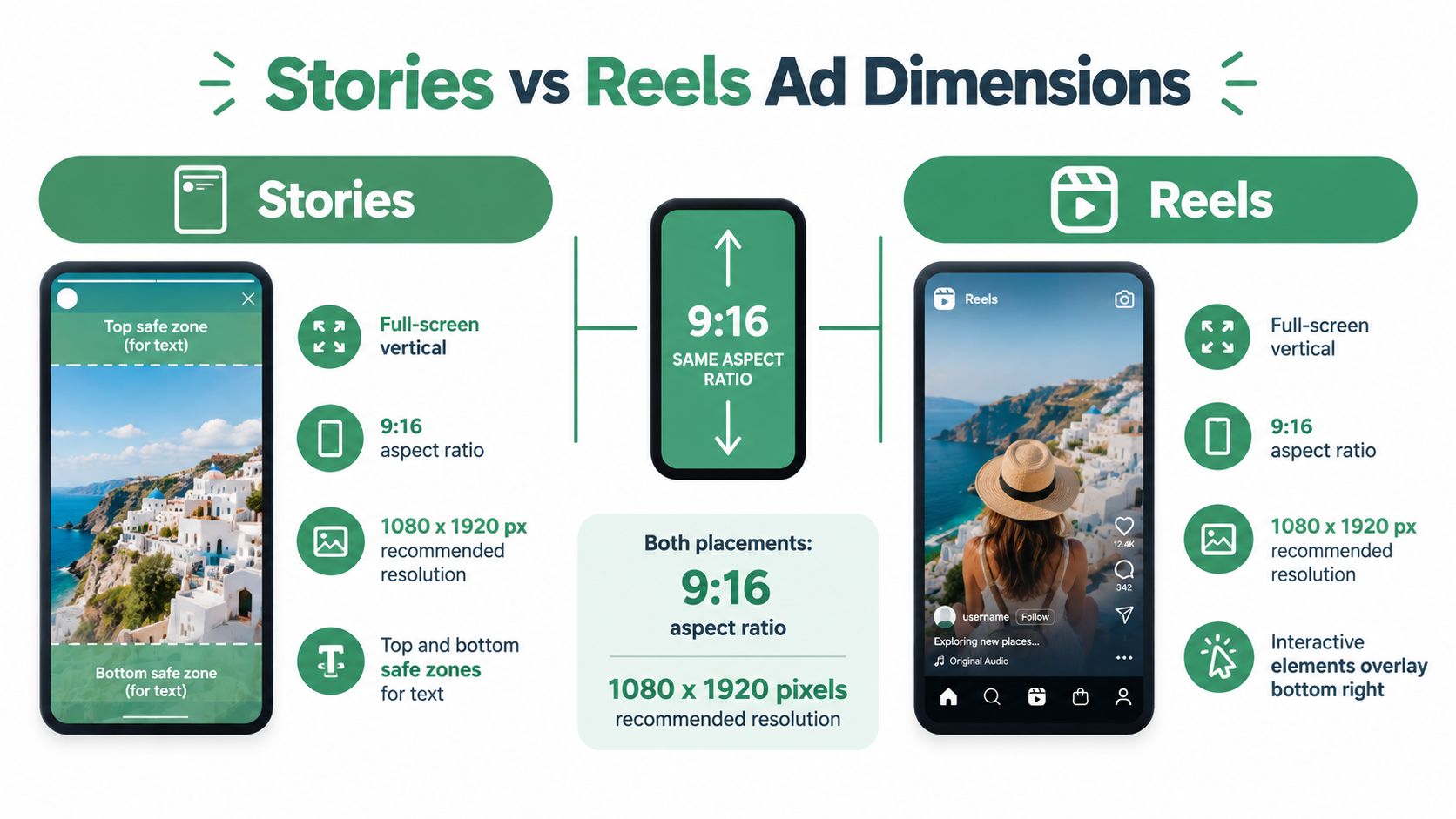
Vertical creative is where lazy resizing gets expensive. If Stories and Reels matter in your placement mix, build for 9:16 from the start. The practical working size is 1080×1920 px.
A square or 4:5 asset can still serve into some vertical inventory, but it usually gives away screen space or creates bad crops. On a phone, that trade-off is visible immediately. A true vertical asset takes over more of the display, gives the subject more presence, and makes the ad feel native to the placement instead of recycled from Feed.
What to upload for vertical placements
Use 1080×1920 as the default production file for Stories and Reels. If the team exports larger masters for sharper source quality, keep the 9:16 ratio exactly the same.
For production, the cleanest master set is:
- 1080×1080 for square placements
- 1080×1350 for portrait Feed
- 1080×1920 for Stories and Reels
That three-file system solves a lot of avoidable trafficking problems. It also gives designers a clear decision framework instead of forcing one canvas into every placement Meta allows.
Why feed creative underperforms in Stories and Reels
Meta's guidance for these placements allows multiple aspect ratios, but the practical winner for mobile-first delivery is still 9:16 because it uses the full frame and leaves less to platform rendering choices, as Meta explains in its Stories and Reels placement documentation.
In live accounts, repurposed Feed creative usually breaks in three predictable ways:
Letterboxing
The ad sits inside the vertical frame with empty space around it. It looks adapted, not designed for the placement.Hard cropping
Auto-cropping trims the top or bottom first. That is often where the offer, product detail, or logo sits.UI interference
Stories and Reels have interface elements competing for the same screen area your text wants to use.
Treat the top and bottom zones as unsafe for critical text and logos. The production rule is simple.
Choosing the right ratio based on inventory
This is the part most spec roundups skip. The question is not only which dimensions Meta accepts. The question is which canvas matches the inventory you expect to buy.
If the campaign is built for Stories and Reels reach, use 9:16 and compose for a full-screen mobile experience. If those placements are secondary and the team only has budget or time for one image variant, a 4:5 asset may be an acceptable compromise. It will travel better than square, but it still gives up screen share versus full vertical.
That trade-off matters. More screen real estate does not guarantee stronger performance, but it does improve your odds of winning the first second of attention, especially in fast-scrolling consumer accounts.
If you are adapting motion assets for Reels, video resizing with RenderIO is a practical shortcut for producing a clean 9:16 export without rebuilding the file from scratch.
A production habit that prevents placement issues
Keep separate masters for square, portrait, and vertical. Teams that do this catch composition problems before launch. Teams that do not usually find them after spend starts.
The common failure is one shared “master” that gets stretched, cropped, and re-exported at the last minute. That is how text slips under overlays, products lose framing, and the vertical placement ends up spending on a weaker version of the ad.
If your buying is mobile-first, vertical creative should be planned as its own asset, not treated as an afterthought.
Carousel and Collection Ad Image Sizes
Carousel and Collection ads punish weak cropping faster than almost any other static format. You are not designing one image. You are designing a sequence of cards, or a cover plus product grid, and small framing mistakes show up immediately in scroll and in swipe behavior.
For carousel cards, the safest production choices are 1080×1080 px at 1:1 and 1080×1350 px at 4:5. Both can run well. The better choice depends on placement mix and how tightly the product needs to be framed.
In practice, 1:1 is usually the safer carousel format. It gives every card predictable composition, keeps product edges from getting clipped, and makes multi-card storytelling easier to control. If the campaign is heavily mobile-feed weighted and the creative was built with extra vertical room from the start, 4:5 can win more visual share on screen. The trade-off is tighter tolerance for text placement and inconsistent crops across cards.
That trade-off matters more in carousel than in a single feed ad.
What works for carousel cards
Use 1:1 when:
- the cards mix product shots, lifestyle imagery, and offer frames
- the same carousel needs to hold up across a broader placement mix
- the design team is adapting existing feed assets instead of producing a carousel-first set
Use 4:5 when:
- mobile feed is the priority
- each card has one clear focal point
- the layout leaves safe space around headlines, logos, and price callouts
A few production checks catch most carousel problems before launch:
- Match framing across cards: Similar zoom level and subject position make the swipe feel intentional.
- Keep text in the center band: Edge-aligned copy gets cramped fast when rendering shifts.
- Make card one do the selling: If the first frame does not stop the scroll, the rest of the sequence does not matter.
- Control visual rhythm: Mixing close-ups, wide shots, and promo cards is fine if spacing, typography, and hierarchy stay consistent.
Collection cover decisions
Collection covers need a different decision standard than carousel cards. The cover has to sell the click, but it also has to work with the product tiles underneath it. A strong standalone image can still be a weak Collection cover if it overwhelms the catalog or leaves the grid feeling disconnected.
Start with a feed-safe composition, then review it in context with the product set. Covers usually work best when the hero product is obvious, the background is clean, and there is enough negative space for the lower grid to feel organized instead of crowded.
The mistake I see most often is a cover designed like a poster. Collection usually performs better when the top image introduces the range, category, or use case, instead of trying to carry every message by itself.
If you have to choose between dramatic composition and clean readability across cards, choose readability.
File Format, Resolution, and Size Limits
Bad exports waste more ad spend than slightly imperfect dimensions.
The production problem is usually not aspect ratio. It is shipping a file that technically uploads, then gets softened by compression, crops awkwardly in secondary placements, or makes small text harder to read on mobile. Pixel specs get the asset accepted. File handling determines whether it still looks premium once Meta processes it.
As noted earlier, Meta supports multiple ratios across placements. That is exactly why export decisions need to follow the placement plan, not the other way around. For day-to-day QA, keep a current Meta Ads platform reference for formats, placement support, and upload requirements open during final checks.
Format choices that hold up in production
Use the format that fits the creative.
| Asset type | Best format choice | Why |
|---|---|---|
| Photography-heavy ad | JPG | Keeps file weight lower in most cases and usually survives platform compression better |
| Text-heavy graphic | PNG | Preserves hard edges, logos, and small type more cleanly |
| Simple animated image workflow | GIF | Use only if motion is necessary and readability stays intact after export |
The trade-off is usually JPG versus PNG. PNG gives cleaner edges, especially on promos with pricing, offer copy, or UI-style graphics. JPG is easier to keep light, which matters when teams are exporting multiple variants and need consistent upload behavior across placements.
I usually default to JPG for photographic creative and switch to PNG when the ad depends on crisp typography or hard-contrast design elements. If the visual difference is minor, the smaller file is often the safer choice.
Resolution and upload discipline
Resolution decisions should protect clarity on mobile, not just satisfy a minimum.
A few checks prevent expensive rework:
- Build from a placement-specific master: Create 4:5, 1:1, or 9:16 layouts intentionally instead of resizing a square file at the end.
- Export at a resolution that preserves detail: Larger files can help, but only if the added pixels support sharp product texture, readable text, or cleaner edges.
- Keep file size under control before upload: Heavy files are more likely to be compressed aggressively, and that usually shows up first in faces, gradients, and small copy.
- Review the ad in placement preview: Interface chrome changes the perceived spacing. A safe margin in the design file can feel tight once the ad is live.
One practical rule matters here. Automatic resizing can fit an image into inventory, but it cannot fix weak hierarchy. If the CTA is too low, the text is too small, or the subject sits too close to the crop edge, no export setting will rescue the ad after upload.
Common Mistakes That Kill Ad Performance
The most expensive mistake in the image size of Facebook ads is assuming technical eligibility equals creative fitness. It doesn't. An ad can meet the spec, deliver normally, and still underperform because the chosen ratio fights the placement.
Recent guidance has moved the conversation away from one universal answer. Feed creative is increasingly framed around 4:5, including 1440×1800, while Stories and Reels are commonly built in 9:16 at either 1440×2560 or 1080×1920, which makes the decision about ratio and screen use, not just dimensions, as noted in Hootsuite's broader social media image size guide.
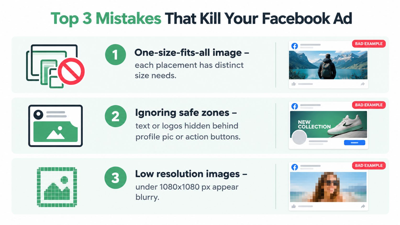
Mistake one, treating square as the answer to everything
Square is the safest default. It is not always the strongest placement choice.
When teams use 1080×1080 for every campaign, mobile Feed often ends up with a smaller visual footprint than it could have had. The ad still runs. It just doesn't occupy the feed with the same authority as a well-composed portrait asset.
Rule to remember: use square when you need compatibility, not when you need maximum feed presence.
Mistake two, reusing Feed creative in Stories and Reels
This is the one that creates the most avoidable waste. Text sits too low. Logos sit too high. The product shot gets cropped awkwardly. Then the team blames the channel.
Safe zones aren't a design preference. They're a placement reality. If your message sits where interface elements compete with it, the ad loses clarity before the user even processes the offer.
A useful follow-on read if this is happening across accounts is NotFair's piece on Meta ads creative fatigue, because repeated asset reuse often shows up first as a placement mismatch before it becomes a broader fatigue problem.
Rule to remember: a vertical placement deserves a vertical composition.
Mistake three, sending bloated files into review
This usually happens with text-heavy PNGs, layered exports, or rushed handoffs from design. The creative may look fine locally, but the final file becomes harder to manage and more likely to create upload friction.
Common symptoms include:
- Soft text after recompression
- Inconsistent rendering between variants
- Slower creative iteration because every fix requires another export pass
The cleanest-performing file is usually the one that was built for the placement early, not the one “fixed” right before launch.
Rule to remember: optimize the source file before trafficking, not after Ads Manager exposes the problem.
Design Optimization by Placement
Most weak ad resizing decisions start with the wrong workflow. Teams design one master for Feed, then force it into every other surface. That's backwards. The stronger approach is to design for the placement that matters most, then adapt outward.
The visual logic changes by surface. Feed needs balance and stop-scroll clarity. Stories and Reels need vertical pacing and safe-zone discipline. Smaller surfaces need simple branding and bold hierarchy.
Feed composition
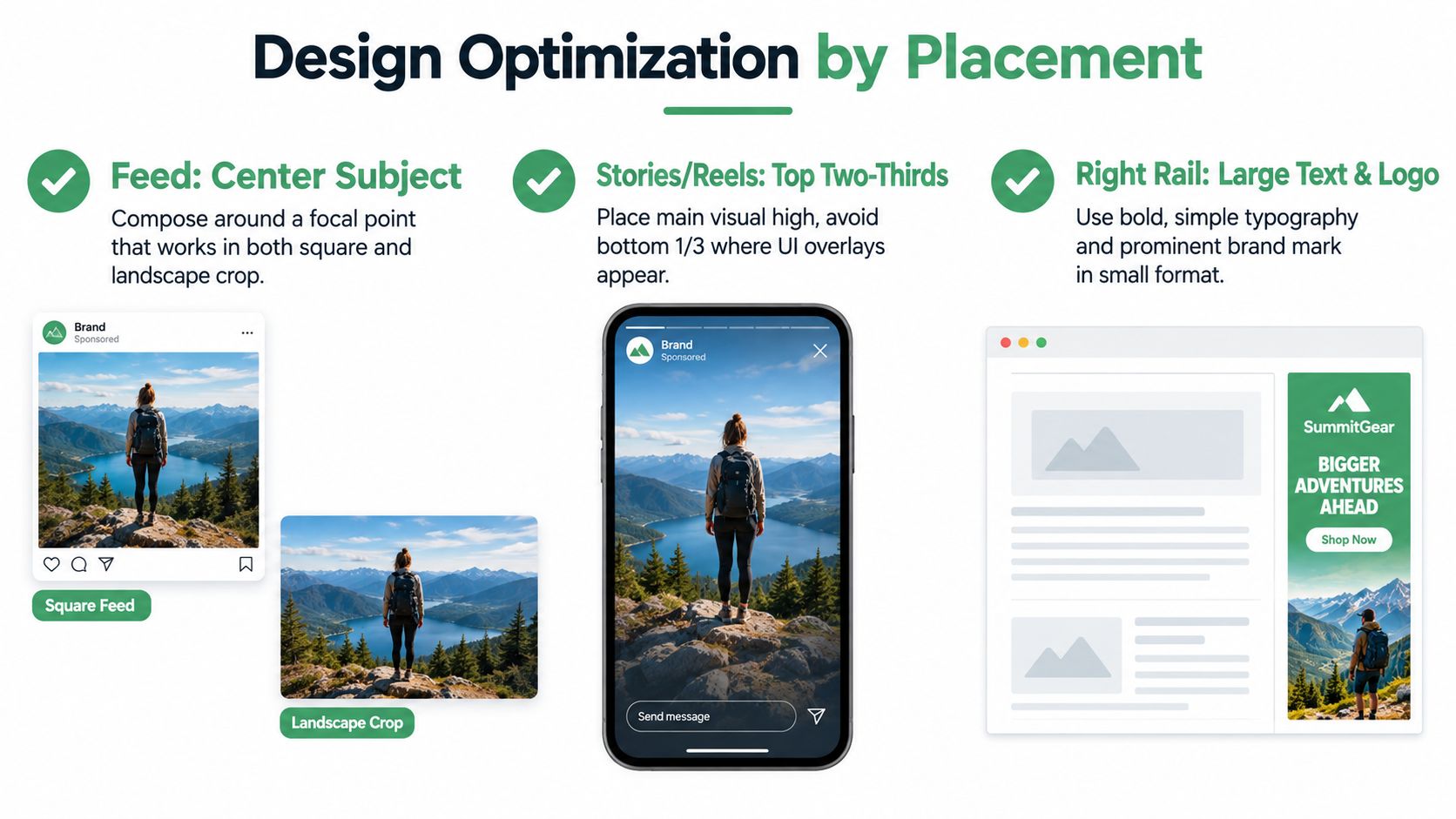
Feed is where center-weighted composition still pays off. If the product, model, or key visual sits too high or too low, the ad gets less forgiving across desktop and mobile rendering.
A simple placement checklist:
- Subject placement: Keep the focal point near the center.
- Headline support: Let the image communicate one idea fast, without needing small embedded text.
- Brand visibility: Make the brand mark readable without turning the whole image into a banner.
Portrait Feed creative often beats square. Not because square fails, but because portrait gives the subject more room to dominate the scroll.
Stories and Reels composition
Vertical placements need breathing room at the top and bottom. That doesn't mean empty space. It means controlled space.
Use this mental model:
- Top area: good for scene setup, light branding, visual context
- Middle band: safest place for the main message
- Lower area: treat carefully because interface elements compete here
If the ad has to explain too much inside the image itself, Stories and Reels usually punish that decision fast.
Design the message so it can be understood from the center of the frame, even if the edges become visually noisy.
Right-rail and secondary surfaces
Small desktop placements demand simplicity. Fine text, intricate product detail, and subtle gradients often fall apart there.
The practical move is to prioritize:
- Large contrast
- One obvious focal element
- A brand signal that survives reduction
If your team needs a consistent operating system for this across creative reviews and account work, NotFair's Meta Ads Codex is a useful planning reference for how media teams can standardize decisions instead of improvising them ad by ad.
If budget allows only one custom version, optimize first for the placement where most spend will land. If the campaign is Feed-heavy, build Feed first. If it's Story- or Reels-heavy, start vertical and adapt the square asset after.
Related Resources and Next Steps
The core takeaway is simple. The image size of Facebook ads is not one number. It's a combination of aspect ratio, placement, and file-size constraint that decides how much of the screen you own, how likely your message is to get cropped, and how cleanly the platform renders the asset.
If you're building a production workflow, keep it tight:
- Create three masters: square, portrait Feed, and full-screen vertical.
- Choose ratio before export: don't let resizing tools make strategic decisions for you.
- QA the actual placement: preview the ad where it will run, not just in your design file.
- Watch for spec changes: Meta updates guidance over time, so always validate against current placement documentation before large launches.
For teams working across image and motion, a current guide to 2026 social media video specs is worth keeping alongside your static-image spec sheet so production doesn't split image and video standards into separate, conflicting workflows.
A practical resource stack looks like this:
- Meta's official help documentation for placement-specific requirements
- Third-party spec guides for quick-reference production checks
- Internal creative templates for square, portrait, and vertical exports
- A launch checklist that catches file-size, crop, and safe-zone issues before trafficking
The best-performing asset usually isn't the one with the highest resolution or the most elaborate design. It's the one that fits the placement cleanly, fills the available screen space, and keeps the message intact. That's why the answer to “what's the right Facebook ad image size?” is almost always: the one built for where the ad will appear.
If you manage Meta campaigns across multiple accounts, NotFair gives AI agents live read access and approval-gated write tools for ad operations, so you can diagnose placement issues, compare creative setups, and make controlled changes without losing auditability. It's especially useful when you're testing square, portrait, and vertical variants at scale and need explicit diffs, logging, and one-call undo before anything goes live.