

Meta Ads size decisions are rarely just a matter of entering a width and height into a design brief. For a paid media manager, the real job is choosing which creative versions deserve production, which placements can share an asset, and when a crop is likely to damage the message. This guide gives agencies, in-house growth teams, and small businesses a practical way to make those decisions before launching a campaign.
The recommendation is straightforward: build around placement intent, not one universal file. Start with a feed asset, a vertical asset for Stories and Reels, and a square or near-square version when the account still uses mixed inventory. Then verify the actual preview in Ads Manager, because a technically acceptable file can still lose its headline, product framing, or call to action after cropping.
Meta’s own Ads Guide organizes specifications by format and placement, which is the right reference for a final preflight in 2026. Treat third-party size charts as planning aids, not as the source of truth: Meta can change placement support, recommendations, or review behavior while your production template remains unchanged.
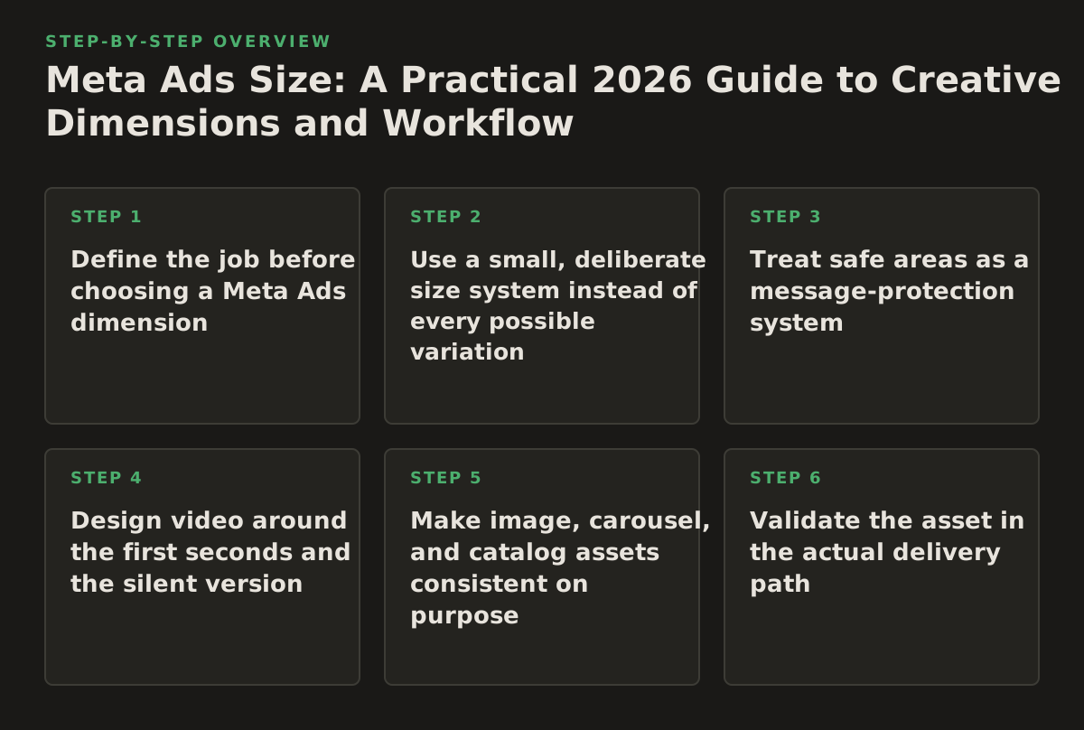
1. Define the job before choosing a Meta Ads dimension
Different campaign jobs need different compositions. A prospecting video that demonstrates a workflow has a different safe area from a retargeting image showing a product, and neither should inherit dimensions simply because the previous campaign used them.
Match the canvas to the viewing behavior. Feed users may pause to inspect a product or read a short argument. Stories and Reels are more naturally consumed in a full-screen vertical environment, where the top and bottom of the frame compete with interface controls. A carousel needs a repeatable frame system so each card feels like part of one sequence rather than a collection of unrelated banners.
Use four questions in the brief
- Where is the first impression happening? Identify feed, Stories, Reels, or a deliberately selected set of placements.
- What must survive a crop? Mark the face, product, logo, price, proof point, and primary action.
- What is the conversion job? A cold-audience hook may need a visual demonstration; a warm-audience ad may need a clear offer or objection handler.
- What can be automated? Decide whether resizing is safe or whether every placement needs human art direction.
For example, an agency promoting a lead-generation offer could brief a 4:5 feed image with one person, one quantified problem, and a short action line; a 9:16 version could use the same opening idea but move the headline into a central safe area. That is not duplicate work: the vertical version has more room for a sequence and must avoid the interface zones.
Failure mode: designing for the file rather than the message. A team may deliver a correctly sized 1080-by-1920 video whose key text sits near the bottom. The export passes a technical check, but the call to action is obscured or visually crowded by platform controls. The fix is to annotate the brief with protected content zones before the designer starts, rather than trying to repair the composition after export.
2. Use a small, deliberate size system instead of every possible variation
There is a production temptation to create one file for every placement, audience, and ad set. That increases review burden and makes learning harder: if each audience sees a different composition, creative performance becomes harder to interpret. The better approach is a minimum viable asset matrix with a clear reason for each version.
A practical starting policy for a small business or lean team is:
- Vertical master: a full-screen version for Stories and Reels.
- Feed master: a portrait version for mobile feed visibility.
- Square fallback: a flexible version for mixed inventory and legacy templates.
- Carousel set: several cards only when the narrative or catalog requires multiple steps.
This is an operating policy, not a universal Meta requirement. Confirm the current eligible placements and recommendations inside the account’s Ads Manager preview and Meta’s official format guide before locking templates. The useful principle is to create distinct compositions where the viewing context changes, not to multiply dimensions for their own sake.
| Campaign situation | Starting asset set | Prioritize | Do not do |
|---|---|---|---|
| Feed-led prospecting | Portrait feed image or video plus square fallback | Fast hook, readable proof, product visibility | Put the only important text at the edge |
| Stories and Reels prospecting | Vertical video and vertical static version | Immediate movement, central safe area, sound-off clarity | Reuse a letterboxed horizontal edit without redesign |
| Retargeting offer | Feed and vertical versions with the same offer | Price, deadline, guarantee, or next step | Change the offer language between placements |
| Catalog or product range | Carousel or catalog-compatible product assets | Consistent framing and product order | Mix photography styles card by card |
| Lead-generation service | One feed concept and one vertical concept | Problem recognition and low-friction action | Use a logo-only opening frame |
Failure mode: creating a “universal” square and forcing it everywhere. A square may be serviceable in several placements, but it leaves less vertical presence in the feed and does not use a full-screen Story or Reel canvas. If production capacity is limited, prioritize the placement responsible for the campaign’s qualified conversions, then add a second composition when delivery expands.
3. Treat safe areas as a message-protection system
Dimensions describe the outer canvas; safe areas protect the information inside it. On vertical placements, interface elements and captions can occupy parts of the screen. Even when the platform accepts the file, visual clutter can reduce comprehension.
Separate content into three layers
- Essential layer: the subject, product, face, or demonstration that makes the ad recognizable.
- Persuasion layer: the proof point, offer, testimonial excerpt, or problem statement.
- Platform layer: logo treatment, button language, stickers, captions, and any interface-controlled elements.
Keep essential and persuasion elements away from the outer edges, especially near the top and bottom of vertical video. Put subtitles high enough to remain readable but not so high that they compete with the opening visual. If the ad depends on a price or qualification, repeat that information in the spoken audio and on-screen text so one crop does not destroy the entire argument.
For a software company selling an AI workflow, the first vertical frame might show the interface in the central portion, a short problem statement above it, and the product name later rather than in the bottom corner. The feed adaptation can enlarge the interface and move the proof point into a more compact block. The core claim stays the same, but the hierarchy respects each canvas.
Failure mode: confusing visible with readable. Designers sometimes keep text technically inside the frame but make it too small after the image is compressed and viewed on a phone. A simple preflight is to view the ad at normal mobile scale, mute the video, and ask a reviewer to identify the offer without zooming. If the reviewer cannot do that, resizing is not the main problem; hierarchy is.
Meta’s business documentation is the appropriate place to verify current placement-specific recommendations and previews, while the Meta Marketing API documentation is relevant when a developer is programmatically creating or managing ad assets. The API can help enforce naming, associations, and review steps, but it does not replace human judgment about whether a crop preserves the selling point.
4. Design video around the first seconds and the silent version
Video sizing is inseparable from editing. A vertical export with a strong opening can outperform a technically perfect adaptation that takes too long to explain what the viewer is seeing. For paid social, create the opening frame and the sound-off experience before polishing transitions.
Make the first visual self-explanatory. Show the outcome, the problem, the product in use, or the person experiencing the relevant moment. Use captions or on-screen labels when the argument depends on spoken detail. Then make the final frame useful without assuming the platform’s button will carry the entire call to action.
A practical video adaptation sequence
- Write the single sentence the viewer should understand from the first scene.
- Record or select footage with enough vertical information around the subject.
- Reframe the subject for the vertical canvas instead of merely cropping the horizontal edit.
- Add captions and test the video muted.
- Check the opening, middle proof, and final action at mobile viewing size.
- Preview each selected placement before publishing.
For a B2B consultancy, the horizontal webinar excerpt may contain three speakers and a slide. The vertical cut should probably feature one speaker, one objection, and one highlighted sentence. A side-by-side crop may technically preserve the source but make every face and word too small to matter.
Failure mode: resizing a horizontal video without changing the edit. The result often has letterboxing, tiny text, or a subject pushed out of frame. If the original footage cannot support vertical reframing, make a different asset: a talking-head crop, a screen recording with enlarged UI, or a text-led motion graphic. A smaller set of well-composed edits is more useful than a large set of compromised exports.
When an account uses automated creative variations, define guardrails first. Permit versioning of background color, opening frame, or headline only when the subject and claim remain intact. Do not let an automation process move regulated disclaimers, prices, or qualification language outside the protected area.
5. Make image, carousel, and catalog assets consistent on purpose
Static ads have a different failure pattern from video: they can be visually clear but strategically interchangeable. If every image uses a different product angle, headline length, and proof style, the team cannot tell whether performance came from the offer, the subject, or the design.
Use a repeatable visual grammar across a test family. That can mean the same product scale, a consistent logo position, a defined headline region, and a recognizable color treatment. Consistency does not mean every ad looks identical; it means the variable being tested is deliberate.
Choose the format by information structure
- Single image: best when one idea or one product view can carry the argument.
- Single video: best when demonstration, transformation, or human delivery matters.
- Carousel: best when the viewer benefits from steps, categories, features, or a sequence.
- Catalog-style delivery: best when the product set and inventory relationship are more important than one editorial composition.
For an ecommerce advertiser, a carousel could move from “choose the right size” to “see the material” to “compare the colors” and finish with the purchase action. Each card should work independently enough to make sense if encountered out of sequence, while the full set still rewards swiping.
Meta’s official format guidance should be used to confirm the current requirements for the selected format and placement. If product information is being sent through an integration, separate the creative question from the feed question: a correctly sized image cannot compensate for an incorrect title, unavailable item, or mismatched landing page.
Failure mode: putting a complete paragraph on every card. Carousels become slow to scan, and the viewer cannot distinguish the cards. Limit each card to one job. If the explanation truly needs several sentences, move the detail to the landing page or use video and captions rather than shrinking the type.
6. Validate the asset in the actual delivery path
Export checks catch missing files and malformed dimensions; placement previews catch persuasive failures. The final review should happen in the same path used to publish the ad, not only in a design tool where the canvas is pristine.
Use a four-stage preflight
- File check: confirm orientation, file type, duration where relevant, readable resolution, and naming.
- Message check: verify that the offer, brand, proof, and action are understandable with sound off.
- Placement check: inspect feed, Stories, Reels, and any other selected destination in Ads Manager’s preview.
- Destination check: click through the ad, test the form or page, and confirm that the landing experience repeats the promise.
Do not approve an ad because the preview thumbnail looks attractive. Expand the preview, inspect the first and last moments of the video, and check the mobile experience. Review the post-click page at the same level: a strong vertical ad that lands on a slow, desktop-oriented form has a delivery problem that no canvas adjustment will solve.
Failure mode: checking only the exported master. A master can be correct while the platform applies a crop, overlays interface elements, or displays a different text treatment. Save screenshots of approved previews with the campaign brief. That creates an audit trail for agencies and gives an automation system a reference for what “approved” means.
For teams using measurement tools, preserve the creative version in the ad name or an external registry. Use a stable convention such as offer_audience_hook_format_version. The exact convention is up to the team; the important mechanism is being able to connect spend, conversions, and post-launch decisions to the asset version rather than to a vague campaign label.
7. Automate the repetitive checks, not the creative judgment
Meta Ads production contains many tasks that are deterministic: checking whether a file exists, confirming a naming pattern, generating derivative exports, recording approval status, and comparing the selected placement list with the available asset set. Those are good candidates for automation. Deciding whether a crop makes the product misleading is not.
Use approval gates before any publishing action. An AI assistant or MCP-connected workflow can prepare a change, explain which ads are affected, and wait for a human to approve it. It should not silently replace a working creative across active campaigns simply because a new file has the correct dimensions.
An approval-gated creative workflow
- Ingest the brief, target placement, offer, and required claims.
- Check each asset against the selected size and format policy.
- Flag text near edges, inconsistent offers, missing captions, and absent fallback versions.
- Generate a review report with previews and the proposed campaign associations.
- Require a named approver to accept, reject, or request changes.
- Publish only the approved association, then record the resulting ad identifier and timestamp.
For example, an agency could use a connected workflow to identify active Meta ads whose campaign now includes Reels but lacks a vertical asset. The system can recommend adding the approved vertical version, show the affected ad sets, and wait for approval. It can also create a reversible change log so the operator can remove the association if the wrong version was selected.
Failure mode: optimizing for technical completeness. An automated checker may report that every ad set has an image, video, and square fallback while missing that the vertical version contains an old price. Add semantic checks for offer dates, currency, product names, and required disclaimers. Where a claim cannot be reliably checked, route it to a human rather than marking it safe.
Cross-channel teams should also avoid assuming that one platform’s “recommended” size is a universal standard. LinkedIn publishes its own ad format specifications, and Google publishes separate image ad requirements. Those references are useful when building a shared asset library, but each channel still needs its own placement preview and policy review.
8. Measure creative decisions without confusing size with performance
Changing dimensions can change composition, message density, and even the visible product. That means “portrait versus square” is rarely a clean experiment unless the team controls the offer, audience, bid strategy, destination, and editing concept. Measure the creative package, not the pixel count alone.
Record these fields for each asset
- Placement or placement group
- Orientation and format
- Hook or opening concept
- Offer and landing-page version
- Audience temperature or prospecting status
- Approval date and replacement date
- Primary conversion event and any quality indicator
Use a starting policy that fits the account’s volume; for example, an illustrative policy might review delivery after a defined learning window or after a predetermined spend amount, rather than reacting to the first few impressions. That is not a universal benchmark. The point is to agree on the review rule before seeing the result, so a manager does not promote a size variant simply because it received an unusually favorable early click.
Separate diagnostic questions:
- Low delivery: is the asset eligible, selected, and technically accepted?
- Low attention: does the opening frame communicate the problem quickly?
- Strong clicks but weak conversion: is the ad promising something the landing page does not provide?
- Good feed results but weak vertical results: is the vertical composition genuinely native, or merely cropped?
- High conversion rate with limited scale: is the asset too narrowly framed for additional inventory?
Do not use a size change to disguise a message problem. If a feed ad has a weak offer, producing it in three orientations multiplies weak assets. Fix the argument first, then adapt the winning concept to the placements that matter.
Instagram’s official Help Center remains a useful place to check current account and publishing guidance when a workflow touches Instagram surfaces. Platform documentation and account previews should be revisited as part of the 2026 operating calendar, especially when a campaign relies on automatic placement expansion.
Implementation plan: move from size confusion to a controlled asset system
Use the following sequence for a new campaign or a creative-library cleanup. It is intentionally ordered so production does not begin before the team knows what must be protected.
- Inventory the delivery plan. List the campaign objective, selected placements, audience, destination, offer, and conversion event. If the placement plan is undecided, do not approve a final asset brief yet.
- Select the minimum asset matrix. Choose the feed, vertical, square, carousel, or catalog versions that have a business reason to exist. Label any additional dimensions as optional experiments rather than mandatory production.
- Write the safe-area brief. Mark the subject, proof, price, disclaimer, and call to action. State what may move during adaptation and what must never be cropped or rewritten.
- Produce the feed and vertical masters first. Recompose each one for its environment. Do not ask a designer to “resize” a layout when the hierarchy needs to change.
- Run the silent and mobile checks. Review the first frame, captions, text scale, product visibility, final action, and landing-page continuity at normal phone size.
- Preview every selected placement. Use Meta’s current Ads Guide and the in-account preview as the final specification check. Capture approvals and record the asset version.
- Connect automation only after approval rules exist. A Google Ads workflow can remain separate from a Meta workflow; for teams coordinating both, Google Ads MCP and Meta Ads MCP can sit behind distinct approval and naming policies rather than one careless cross-platform template.
- Launch with a measurement record. Tie each creative to its format, hook, offer, and placement group. Set an illustrative review date or spend policy in advance.
- Diagnose before multiplying. If performance is weak, decide whether the problem is eligibility, composition, message, audience, or destination. Create more sizes only when the evidence points to a placement-specific constraint.
- Archive and reverse deliberately. Keep the prior approved version, the reason for replacement, and the person who approved the change. If an automation tool makes an incorrect association, restore the previous version instead of improvising during a live delivery period.
The practical recommendation for 2026 is to maintain two strong master compositions, one controlled fallback, and a documented preview gate before expanding the library. Teams that want to connect this process to approval-gated campaign operations can explore what NotFair offers through NotFair, using automation to surface and prepare changes while keeping the final publishing decision reversible and accountable.
Authored with NotFair SEO